It just wasn't what I wanted.
For months I looked online, on Pinterest, anywhere I could for inspiration. And one night, around 4am, it hit me: I wanted plane tickets. Our wedding was a destination wedding for everyone but us. About 95% of the people we invited were traveling.
But what I wanted ... it didn't exist somewhere where I could just order. Thank goodness for Nicole at Glossie, the absolute best designer I've ever met. If you remember her, we featured her stationery designs in this post, and she also designed our logo. But, today, we're talking about our invitations.
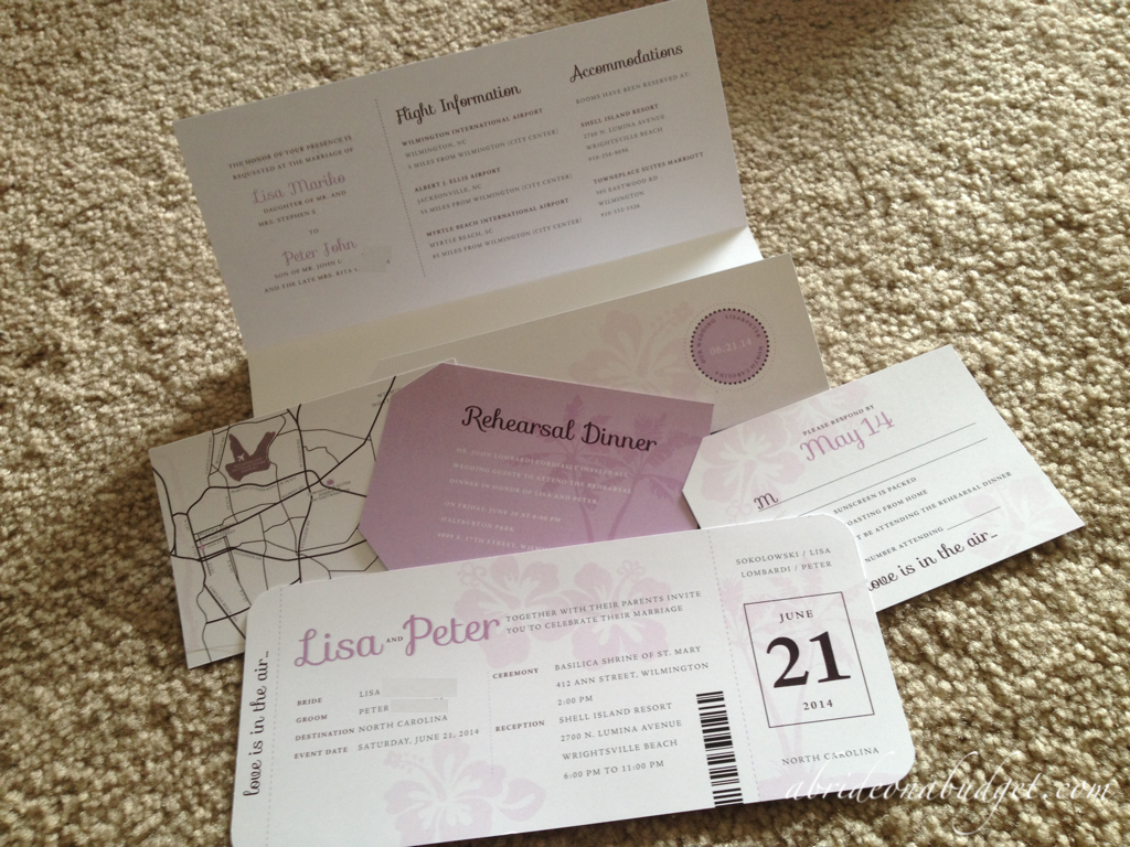
It's not that she just designed one component. Oh no. She designed us a plane ticket for the major part of the invitation, a ticket jacket for the additional information, an RSVP card and rehearsal dinner invitation in the shape of luggage tags, and a map (because I decided I wanted a map instead of directions).
Nicole worked all hours of the night on these. Literally. Since I blog full time, I'm up working at crazy hours. So when I would take a break from working around 2am, I would shoot Nicole an email to ask her to change something.
Because that was me. I'm a pain in the neck client. I'll be honest about that.
See, in life, I always have a lot of ideas, but none ever go together. So I'm sorta very scatterbrained at the beginning. I was lucky that I was able to give Nicole a pretty solid idea at the start ... but then I wanted changes. Once I saw it coming together, it would help my ideas solidify and I'd ask her to change something.
From start to finish, I'm pretty sure it took a month. She sent me the files and I had them printed at OfficeMax.
I went to the store and was handed a closed box. The cashier told me I could open it to check and see that everything came out the way I wanted.
Honestly, I was scared to open it. The files looked great online but there was a chance they wouldn't meet my ridiculous expectations when I had them in my hand. And I wanted, no needed, them to be perfect.
I lifted the top and breathed a sigh of relief. They were perfect. Better than perfect. They were exactly what I had dreamed they would be.
That's when the real fun started.

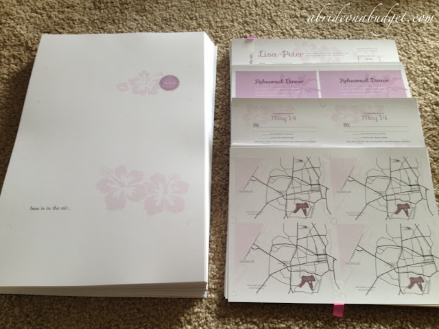
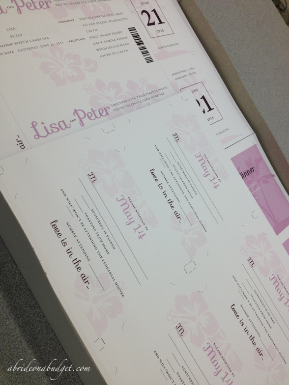
I had 112 or so of each component printed on either 8x10 or 11x17 paper. The holders were one each on the large paper, there were two tickets per 8x10, and then the RSVP cards, maps, and rehearsal dinner invitations were four to a page on the smaller paper. What was awesome is that Nicole set up the files that way, so I didn't have to figure out anything before sending them to be printed. She also put cut lines on the file so I was able to figure out exactly where to cut once I had the pages.

And then I had to chop. And chop. And chop. It took me 12 hours total to cut the components with a paper trimmer. I split it into three sessions because there's no way that I could sit hunched over for half a day straight.
When I was finally done cutting (with only one casualty, believe it or not), it came time for me to decide about how much more intense I wanted to be.
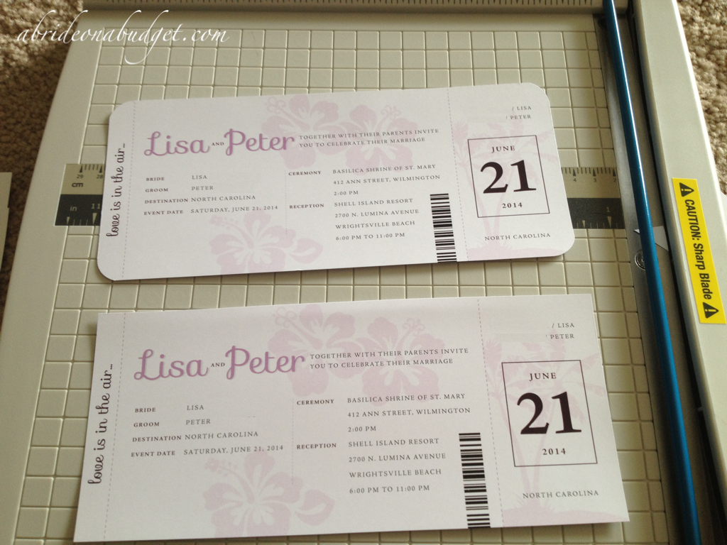
I used a corner rounder, then sent my mom the photo above. I asked her what she thought was better: the one with rounded corners (which actually looks like an actual boarding pass) or if I could just leave the corners squared because it was easier.
What she didn't know is I had a EK Corner Rounder (which is my favorite tool ever).
You stick the corner in and push down, and the corner is rounded and uniform every time. So that's what I went with. It took extra time, but it made the invitations look so much more professional. And that's what I needed. After having them professionally designed, I wasn't going to drop the ball on my execution.
And that's a good lesson about DIY. I always encourage people to only DIY what you can actually pull off. If you start to DIY something to save yourself money and you can't actually do it, you'll end up costing yourself money. And, my biggest rule of thumb was if I DIY'ed something, I didn't want it to actually look like I made it myself. Cutting corners on, well, cutting corners would have done just that.
The truth is, I didn't DIY these. I couldn't. I tried but the level they needed to be at far exceeded my skills on MS Paint and PicMonkey.com. I tried for a little while before realizing there was no way I could pull it off. So I didn't. I went with Glossie, and it is impossible for me to be happier with our finished invitations.
(Small aside: I know there are parts of the invitations that look blurry and imperfect. That's where I blurred out our last names and other information. There aren't any imperfections on the actual invitations.)
BRIDAL BABBLE: What's a DIY project you decided to scrap?


These are nice, too. It is great that you can save money in your budget by finishing them yourself. And now I know there is such a thing as a corner cutter!
ReplyDeleteAria H.
Those are fantastic! I like that you had a corner cutter and could make them really look like tickets.
ReplyDeleteslehan at juno dot com
So glad you are happy with how they turned out. I love them too, the rounded corners definitely was the route to go.
ReplyDeleteWhat a great wedding invitations that you created and put together. I really like the idea of a plane ticket invitation. I like how they looked when finished. I bet your wedding guests thought they were gorgeous.
ReplyDeleteVery happy you took the time to round the corners on them Lisa. You got the high end professional look and I can't believe they came in the post! Well done and thanks for sharing them with us. :)
ReplyDeleteIt's been quite a few years since I got married, and boy, have things changed. Back then you had a handful of local businesses you could order your invitations from. The costs were pretty much the same no matter where you went. We didn't have internet and people didn't mail order things like this. We were also very limited on styles, which tended to be all pretty basic. I would have loved to have the choices available today. It's great that there are also so many options for where to actually order them from, because that came really help keep the costs down.
ReplyDeleteThey great. I love the colors.
ReplyDeleteThey look so awesome - I wish I has it in me to DIY something for my wedding!!
ReplyDeleteThese are so freaking adorable!
ReplyDeleteI have to give you a lot of credit for the time you spent on your invitation. They turned out well and you saved a lot of money Rosanne rosans4@comcast.net
ReplyDeletecool ideas
ReplyDeleteAny way you could give a rough total that you spent for your invites between getting them designed by glossie and printed at office max?
ReplyDeleteNatalie, I paid $404 to have 112 invitation printed at Office Max. This includes a paper trimmer. I had 84 8x10's printed for the RSVP cards, maps, and rehearsal dinner. There were an additional 56 8x10's printed for the ticket itself. Then, 112 11x14's printed for the ticket holder. The 11x14 is expensive, so you can definitely save if you can keep it all on 8x10's.
DeleteAs for pricing for the design, it depends on Nicole at Glossie, so I can't quote that at all. I'm sure she will be able to give you a quote.