I knew what our save the dates would look like before we even had a date. I found an image on Pinterest and was set to make it work for us.
And I did.
It was witty and whimsy and beachy and absolutely set the tone for what our upcoming nuptials would be. For our actual invitations, I just imagined I would do something generic. I would find one online that I liked at some website that prints for you or I would go to a store and find some simple print at home ones in our color scheme and that would be that.
But at Christmastime, we went out to dinner with Pete's dad and got to talking about the wedding. "I can't wait to see what your invitations are," he said. "You set the bar so high with your save the dates."
That's when it hit me. I had set the bar high with the save the dates. Too high maybe. And there was no way a generic invitation was going to be the appropriate sequel. I started looking online, becoming overly critical of what I wanted. No amount of purple paisley swirls was going to fit what I wanted. I spent weeks online, scouring over every website, hoping that someone would add what I wanted.
No one did. Weeks when by and I spent nights stressing over how I'd never find an invitation I like.
And then Nicole from Glossie.ca emailed me. "Hi," she said, "I can save you from your invitation nightmare."
Okay, I'm paraphrasing here, but that's exactly what she did.
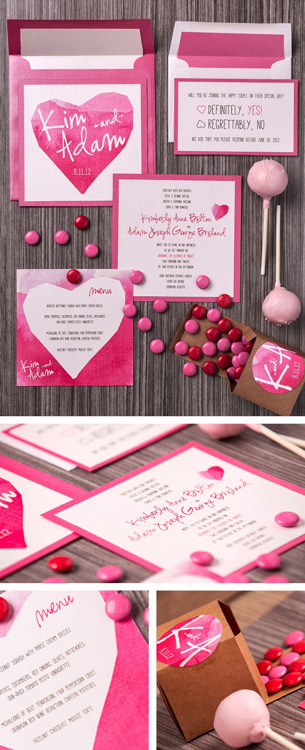
 |
| Photo from http://glossie.ca/kim-adam/ |
I had been searching online and found what I wanted, but there was no way I could design it myself without it looking like a Microsoft Paint file. As creative as I can be with construction paper and scissors, I can't design on a computer. I mean, I could if it was something simple and unimportant, but wedding invitations are some of the most important pieces of mail you will ever send.
Nicole knew what I had in mind and sent me over an example of an invitation she had designed that was similar to what I wanted. Very similar. So similar that I knew I could place my entire trust in her.
But these were still my invitations and although her example was very similar, it wasn't exactly what I wanted. So I emailed her a reply with a half dozen questions: Would you be able to change colors around or would they have to be black and white? And could you create a separate card for directions/hotel information? And, would it be possible to create an address label template with the plane on it (so that I could type the addresses and affix that to the front of the envelope I mail them in?
Her answer was simple: She could do everything I wanted. She sent me an example with dummy text while I was waiting for confirmation on times from our venues. She changed colors around and through the one month design process, she changed text more times than I can even remember.
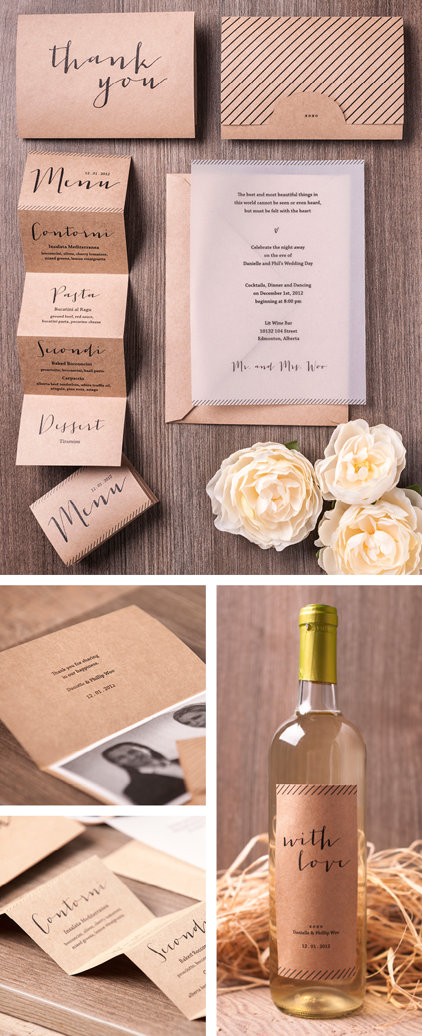
 |
| Photo from http://glossie.ca/danielle-phil/ |
If you're like me, and you have questions that happen at night and you are flipping out because you don't have an answer, she will be there. It was such a great comfort to have.
My original plan was to print these at home, but a printing malfunction on something unrelated made me realize that was not possible. I didn't have a backup plan. So I emailed Nicole an email of desperation. And at some hour in the wee morning, she emailed me back a backup plan. And that's what we ended up going with. (If you take a look at the Process section of Glossie's website, you'll see she generally will print and assemble the entire order for her clients, so if you go with that, you wouldn't have the issue I did).
If I had this sort of question and I had generic box invitations, that box wasn't going to answer me back. It wasn't going to tell me what to do. It wasn't going to hold my hand for four weeks and make me feel that everything was going to be perfect.
You need a designer who actually cares to have that type of interaction. And, as much as every bride wants to say she's not bridezilla, every bride needs that extra attention. Every bride just wants everything to be perfect and with Nicole, I knew it would be perfect.
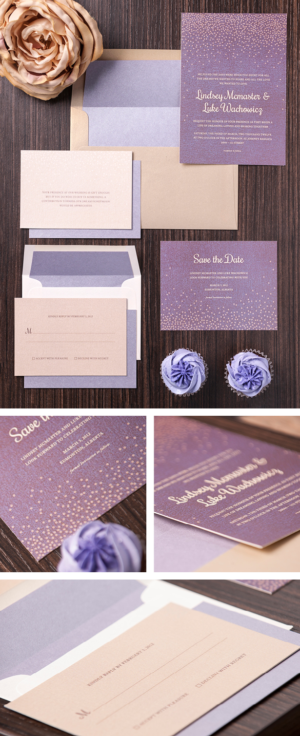
 |
| Photo from http://glossie.ca/lindsey-luke/ |
A generic website isn't going to afford you that luxury.
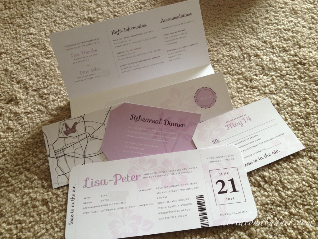
What I also gained from Nicole that I wouldn't have if I didn't work with her is that she was able to design additional components for me. An invitation set is generally the invitation and an RSVP card. That's pretty much it. For our invitations, we also needed a directions card (although Nicole and I decided a map instead of directions would be best) and a rehearsal dinner invitation. Nicole designed both of those for me to match the rest of the set. The map is absolutely something I would never have been able to do on my own and I would never have gotten if we went with generic invitations.
After everything was finished and I had triple checked with my mom to make sure these were perfect, Nicole created print files for me. She had created them with one invitation per sheet, but it would save my budget about $60 if she could create a print map with two invitations per sheet. I asked her and she nearly immediately changed it for me. That personal attention will make me forever grateful to her.
I picked up our final invitations two days ago and when I saw them in my hand, I was floored. They are exactly what I wanted. They're everything I could have wanted. I did set the bar high with our save the dates, but these invitations have us soaring over that bar. And there's no way I could have ever achieved that without Nicole at Glossie.ca.
(Small aside: Our invitations are not featured in the images above. I will show you them in a blog post in the future, but I can't post about them until our friends and family have received them.)
BRIDAL BABBLE: Which of the featured invitation sets from Glossie is your favorite?
Glossie is who designed our wedding invitations. | |
|---|---|
Check out our wedding invitations post.
|


Oh my gosh! They have SO many adorable options! I love that she has given all the extra attention to your invitations and I know they are going to be perfect!!
ReplyDeleteThose are so pretty!! I wish I had those options when I was getting married!!
ReplyDeleteThose are sweet. I'll have to pass this on to anyone planning a wedding.
ReplyDeleteWere the invites from here a lot more expensive then generic ones?
ReplyDeleteBelieve it or not, no. I mean, okay, if you're buying a pack of 50 for $39.99 and printing them at home, then yes, these are more expensive than the generic ones. But if you're planning on finding a website and using their templates, then having a designer do them will be pretty on par. Plus, if you really want to stay in your budget, you could hire a designer to create a design and template and then print them at a local print shop (or OfficeMax, etc.).
DeleteThese were lovely! I know how important every aspect of a wedding is and I'm glad that you found what you wanted.
ReplyDeleteGorgeous! These are perfect wedding invitations that will put lavish impression on guests. The pink-white palette and purple dots are giving a graceful look to all these invitations.
ReplyDeleteI like the first hearts one the best.
ReplyDeleteAria H.
The purple ones are very pretty, too.
ReplyDelete